Kingston Children’s Hospital
For this project I decided to design a hospital logo. I focussed on research into Great Ormond Street, and how a crying child as a logo works great for donors, however less well for the children entering the hospital. I interviewed many people, and came to the conclusion that children do not like hospitals becuase they are simply not ‘home’. I collaborated with an illustrator for the illustrations but dictated colour pallet and shadows.
Branding Brief
Johnson Banks/Kingston University: Logo Design and Branding (Theoretical and ongoing)
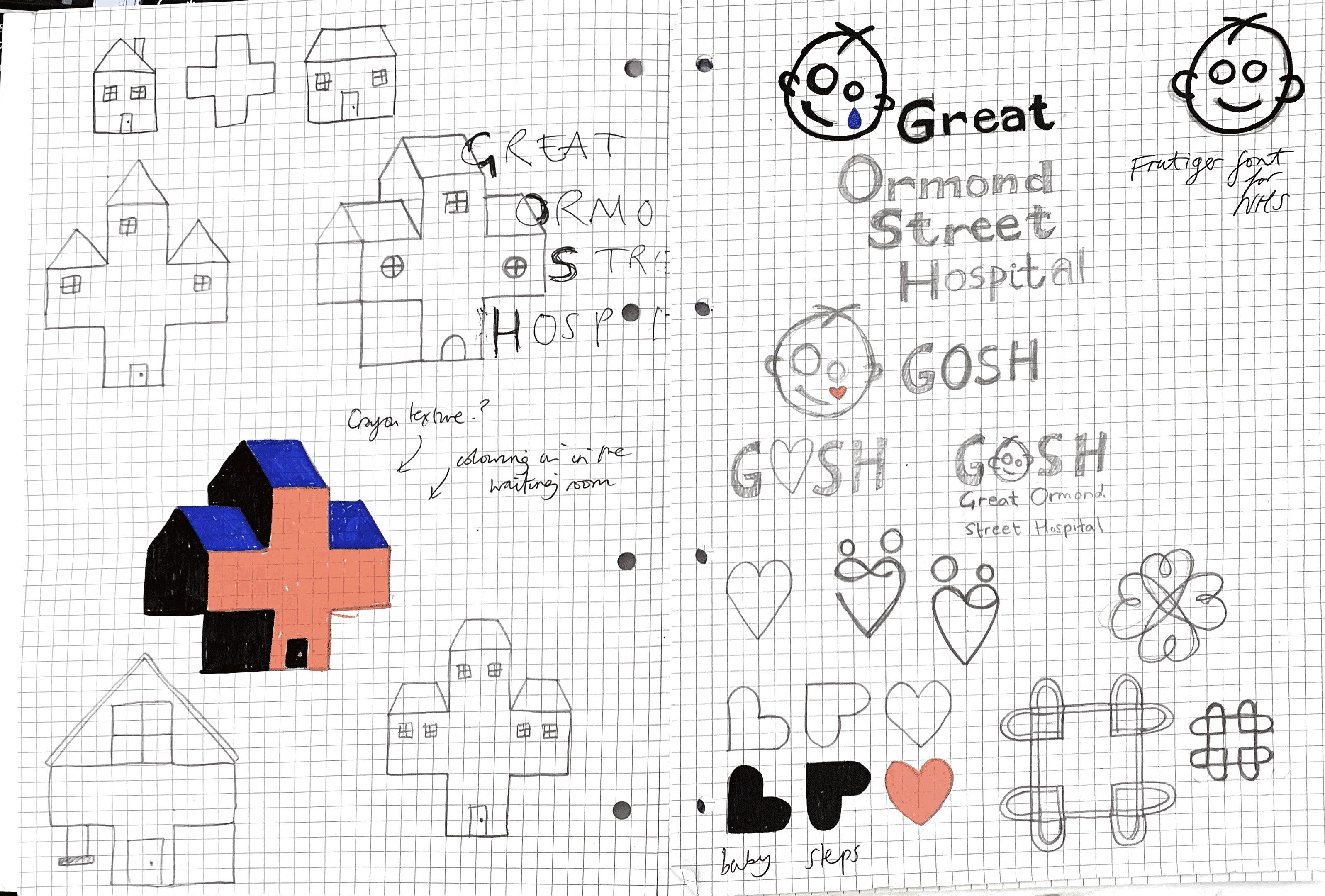
🏡+🏥
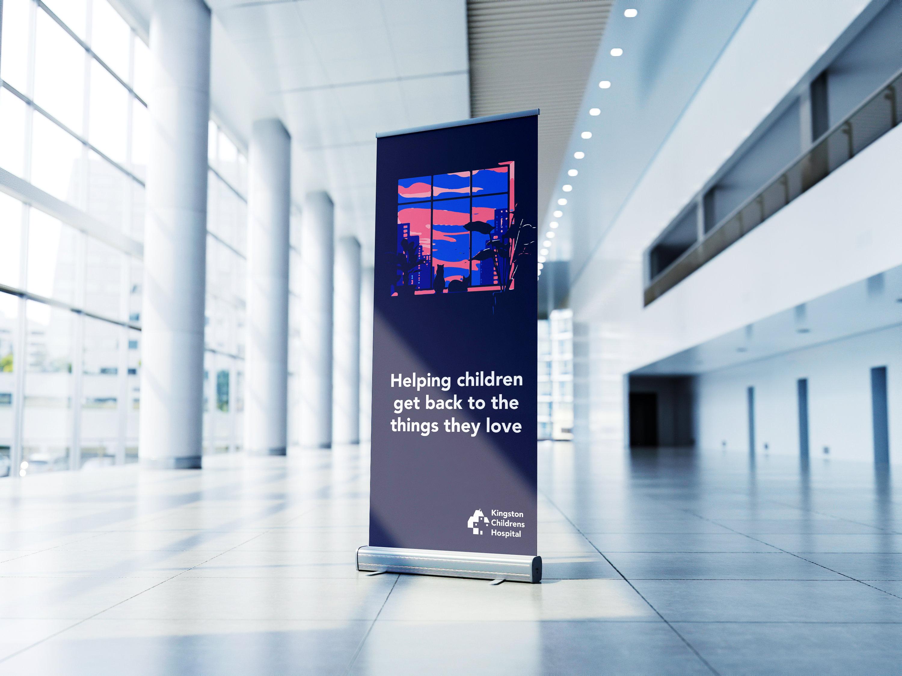
I challenged myself to make the logo more homely for the children to feel a greater sense of comfort and care. Warm lighting with the slogan ‘helping children get back to the things they love’, was at the forefront of this theoretical campaign.
Exploring how the logo could work for an age range of 0-18 years was also exciting. The logo could work in spray paint for teens and crayons colouring in for the younger children.


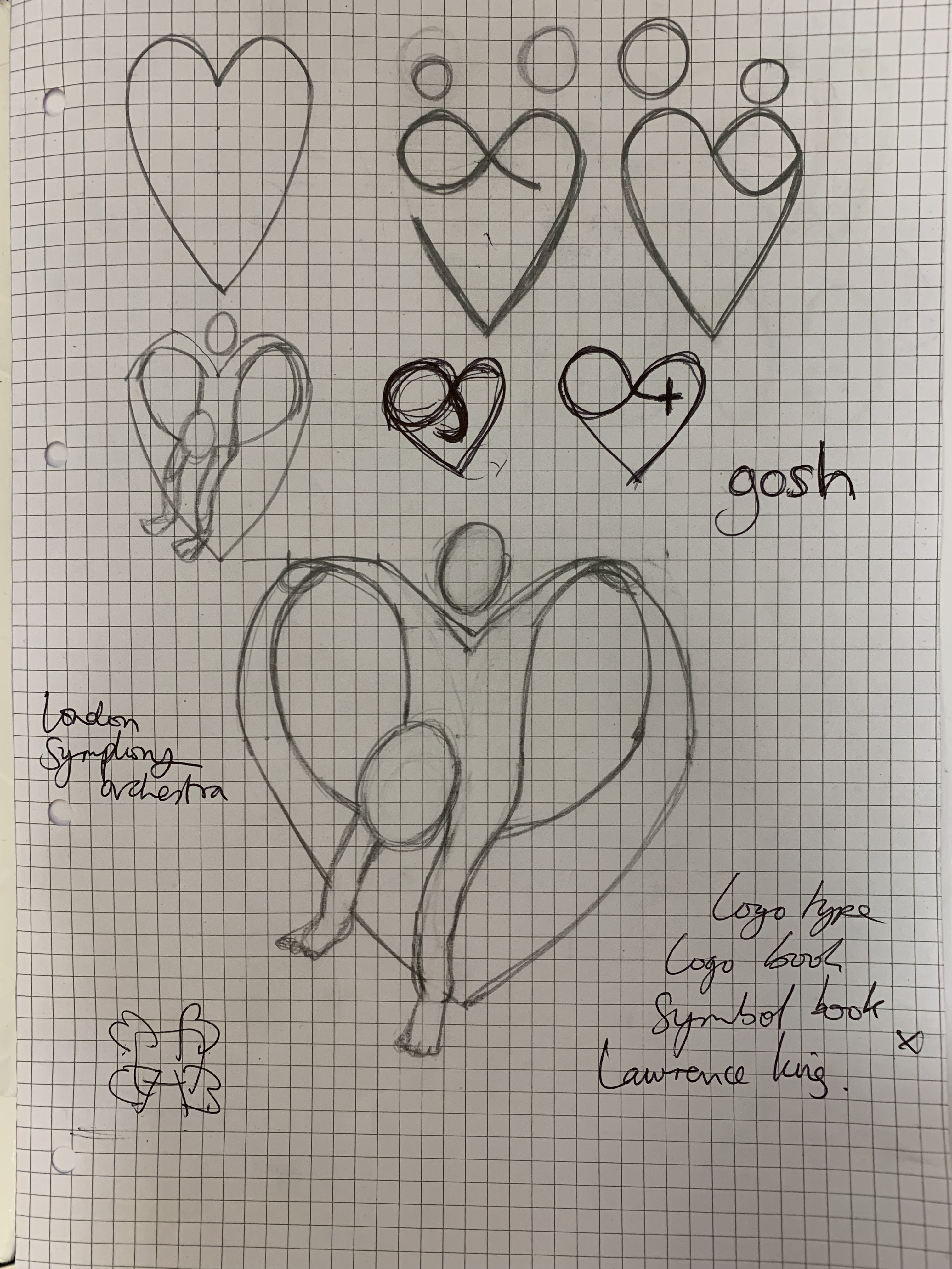
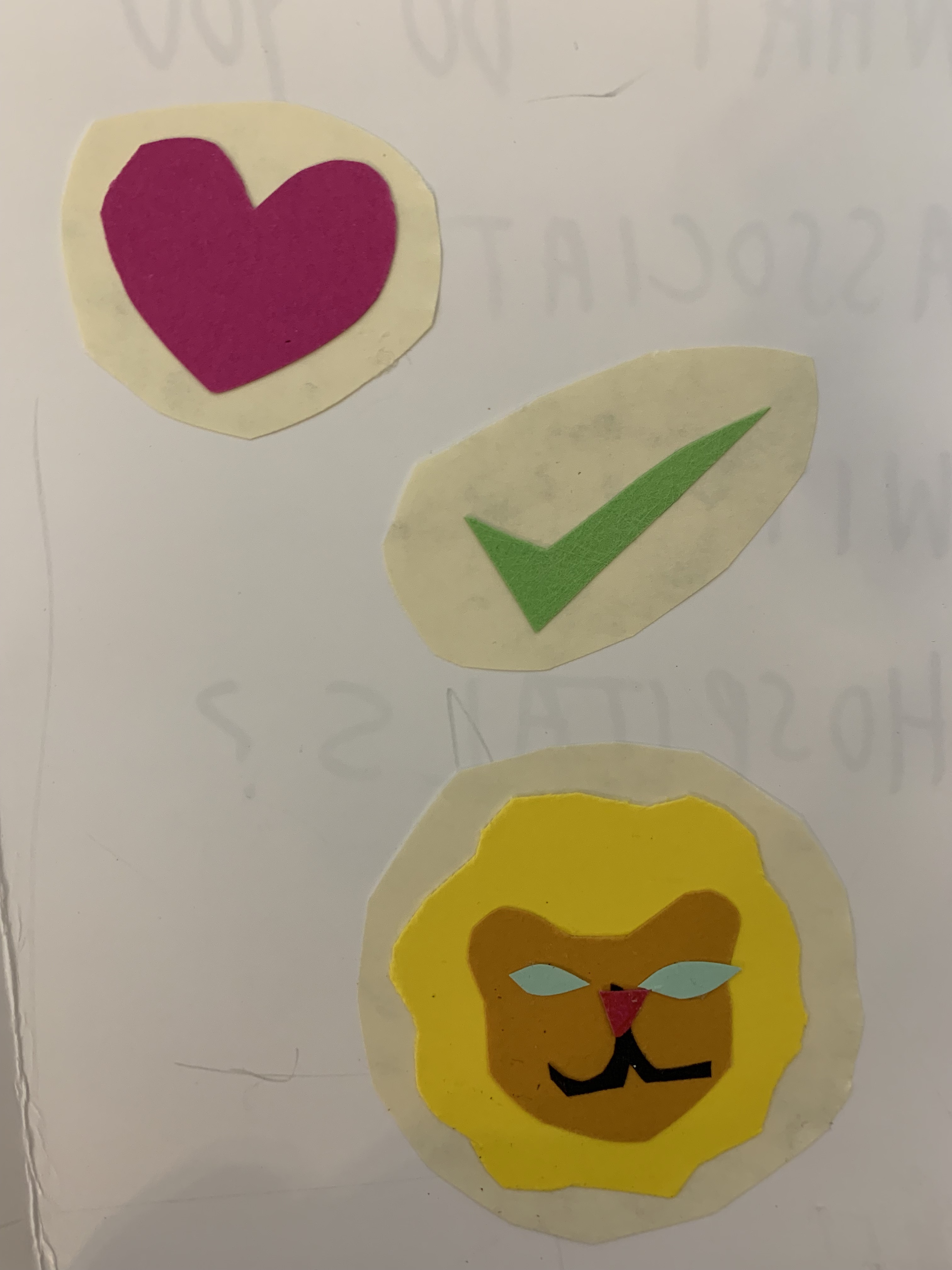
Background process included interviews, drawing, colouring and collage:


